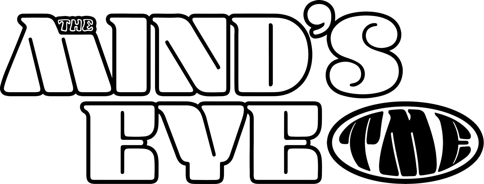
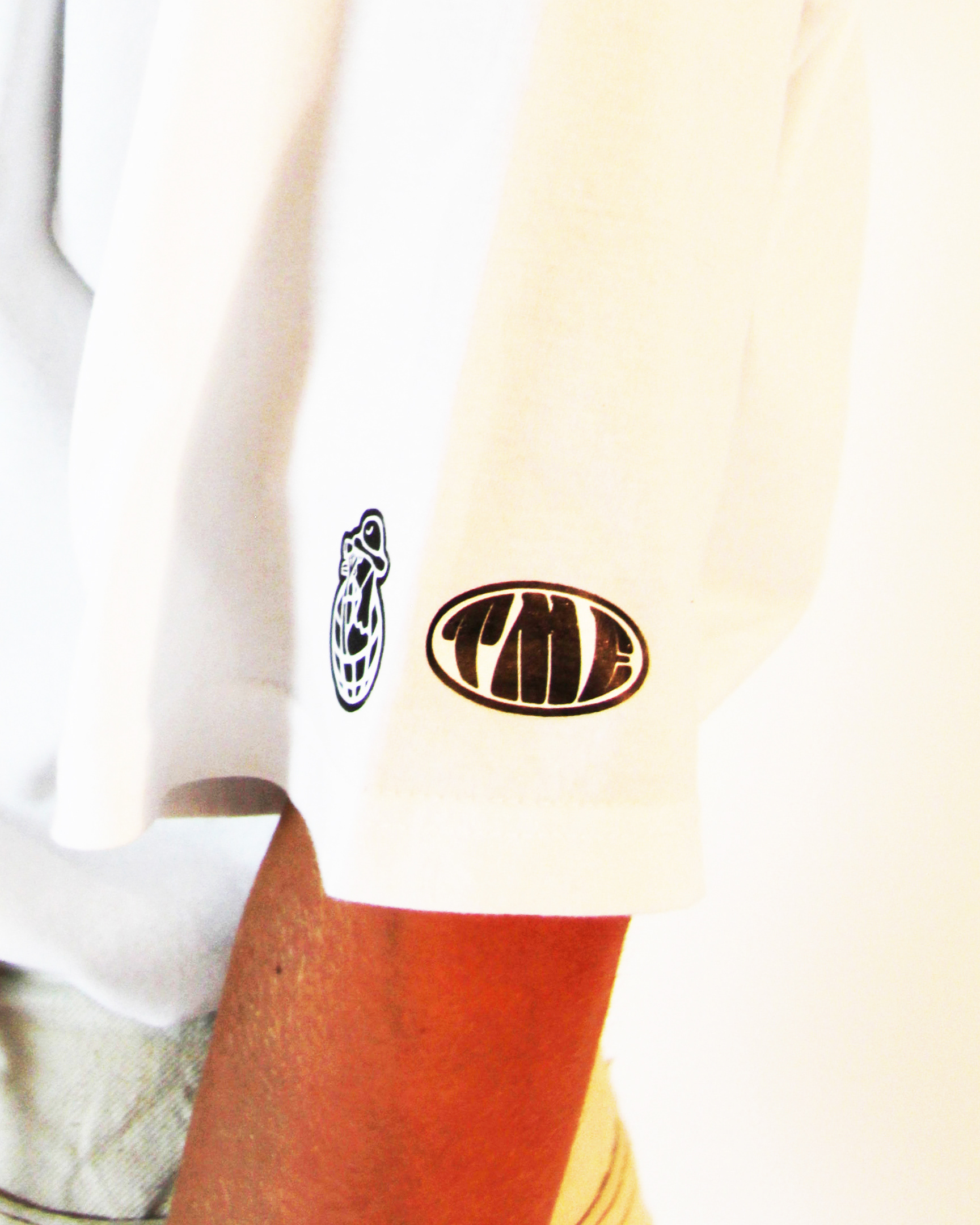
The psychedelic four piece, The Mind’s Eye, contacted me regarding an update of their existing logo, two t-shirt designs and a new album cover. Students of rock's classics, they wanted their logo to be in a similar timeless form like Led Zeppelin and The Rolling Stones. Utilising a groovy font, I changed little except kerning and outlines, placing the prefix onto the M as a nod to one of the band’s personal favourites, The Doors. Allowing for a more versatile symbol the second variation, with an applied bloated warp, emphasised the loudness of their presence.
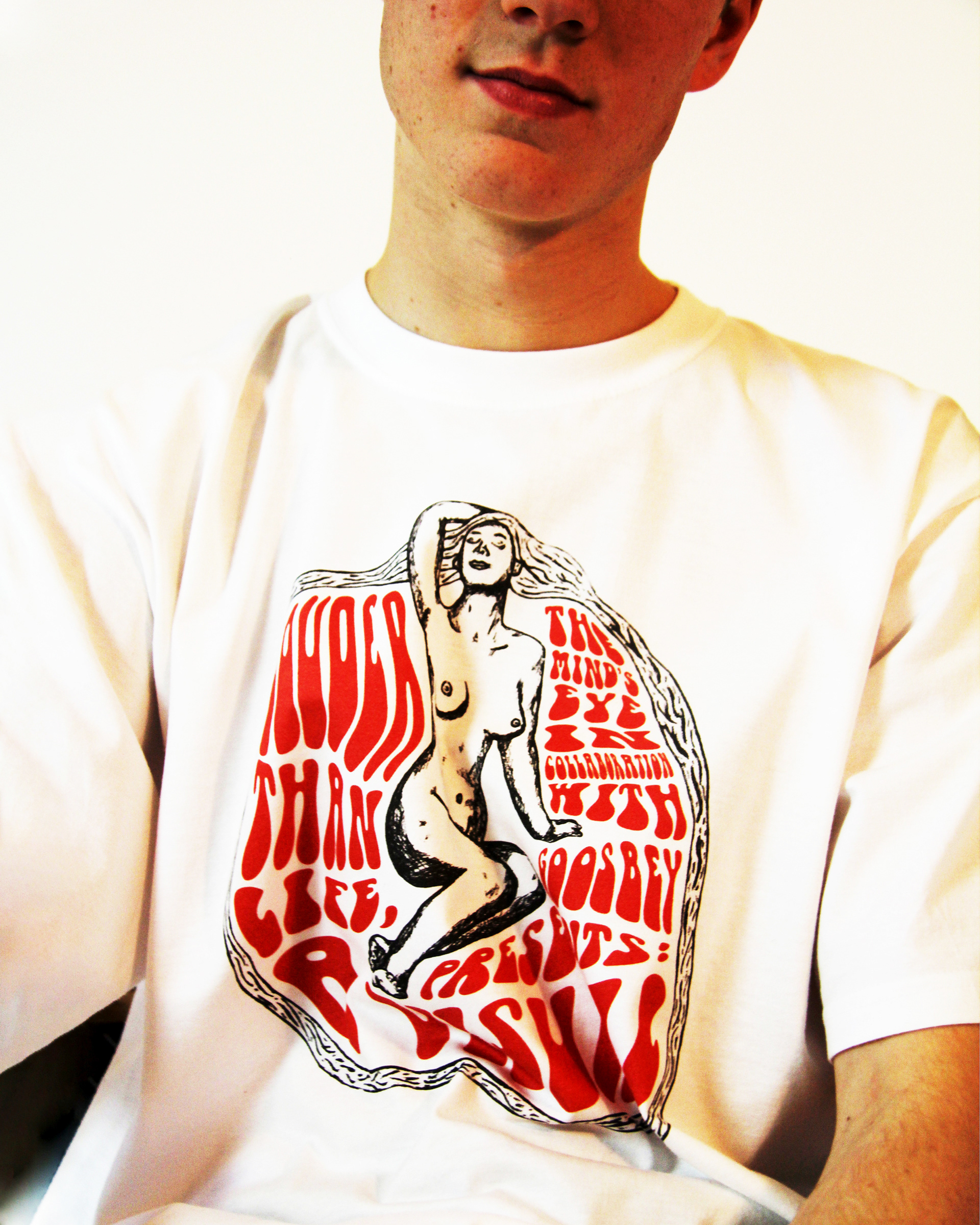
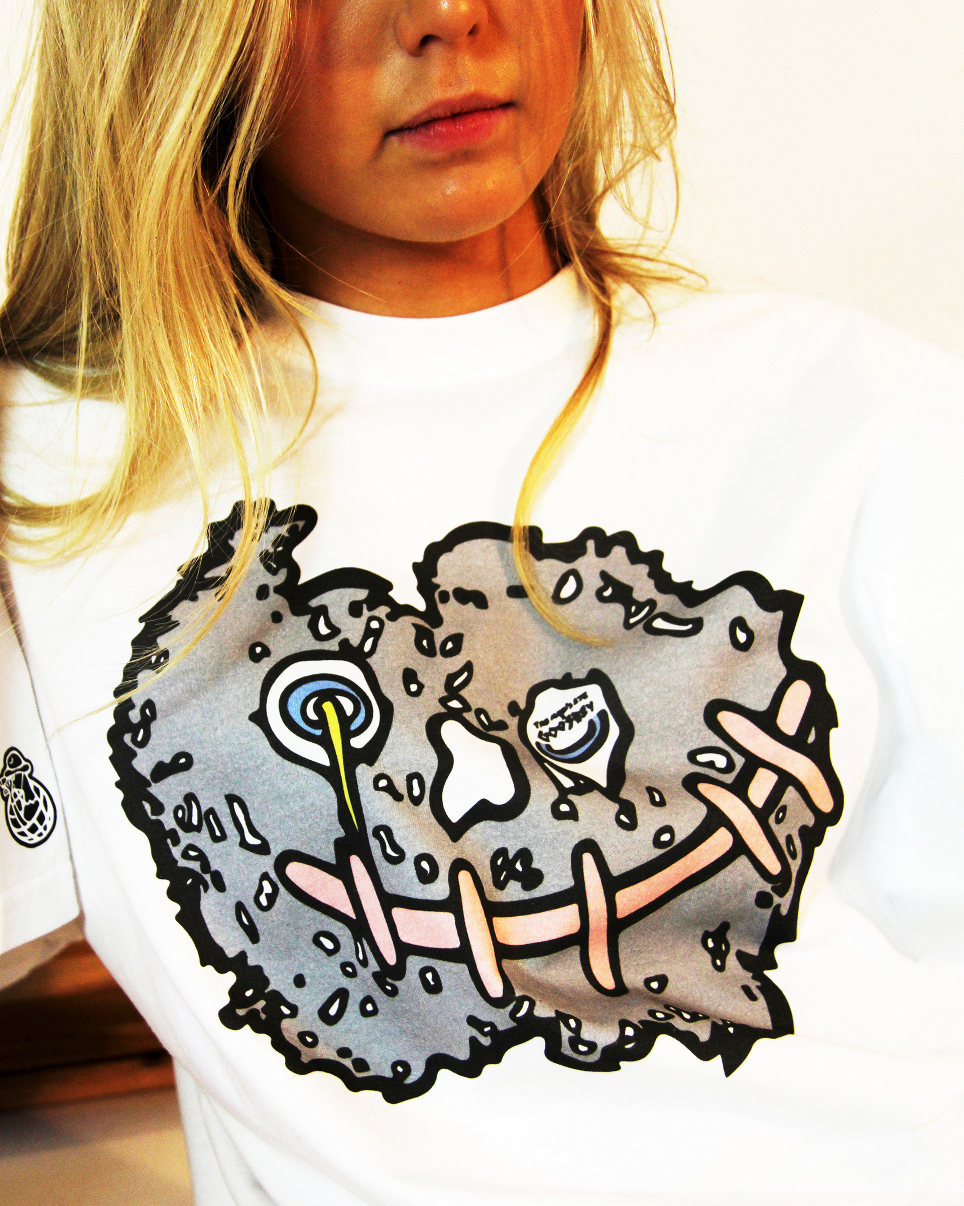
The designs for the t-shirts came primarily from two artists who were active in the 60's psychedelic scene, Wes Wilson and Robert Crumb. The former inspired the more Art Nouveau Woman design whilst the latter’s work with The Grateful Dead inspired the more cartoony Face design (transforming an already existing symbol associated with the band).
For the album design I was inspired by the rock tradition of covers shot in nature such as Pink Floyd’s Atom Heart Mother, Jethro Tull’s Songs from the Wood and, in particular, John Lennon’s John Lennon/Plastic Ono Band. After taking a few basic photos of trees in my local park, I decided upon a more artistic and minimalist route, tracing over one on my iPad and applying it on a mono green coloured background in Photoshop.


